
Marvel's new sign language poster is almost perfect – apart from one tiny 'typo'
- Jan 10, 2024
- 1 min read
It combines style and function.
The most recent design to emerge from the MCU might have slightly swayed our opinion. To promote its new Disney+ series, Marvel has produced an ingenious poster design, using sign language to spell out the series title, Echo.
Not only is the poster a positive step for inclusivity but the design is both elegant and striking, creating a unique balance of functionality and style. However, while this might seem like a definitive sign that movie poster design is on the up, ASL (American Sign Language) signers have pointed out that the design might not be as praiseworthy as it appears.
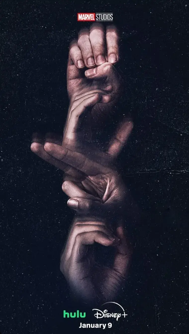
The poster's accessible design references Echo's deaf protagonist Maya Lopez, yet TikTok creator Vera Goudie shared that the poster actually contains a 'typo' since the fingerspelling for the letter 'H' is the wrong way. While many non-signers have praised the design's accessibility, Goudie suggests that there could've been further consultation with a deaf graphic designer to avoid miscommunication.
While Marvel's design isn't faultless the effort to integrate accessibility into its design is certainly commendable. With a hard of hearing protagonist at the centre of its story, Echo's poster is not only an attempt at functional inclusive design but also a clever storytelling motif.


Comments